Have you ever visited a website and been completely in awe of the elegance and simplicity of its design? For me, that website is Stripe. Stripe is a company that allows people and businesses to accept payments online and in mobile apps. That doesn't sound like a company that would have an exquisite website design, but look at how Stripe describes themselves on their about page.
"We think that building an internet business is a problem rooted in code and design, not finance."
Rather than making design an afterthought, it's treated as a first-class citizen at Stripe. You can almost feel the hours of work spent iterating over designs and making minor tweaks when viewing the website's pages. In this article, I'm going to break down how Stripe creates these beautiful designs and give some tips and tricks to web designers and developers alike.
The Design
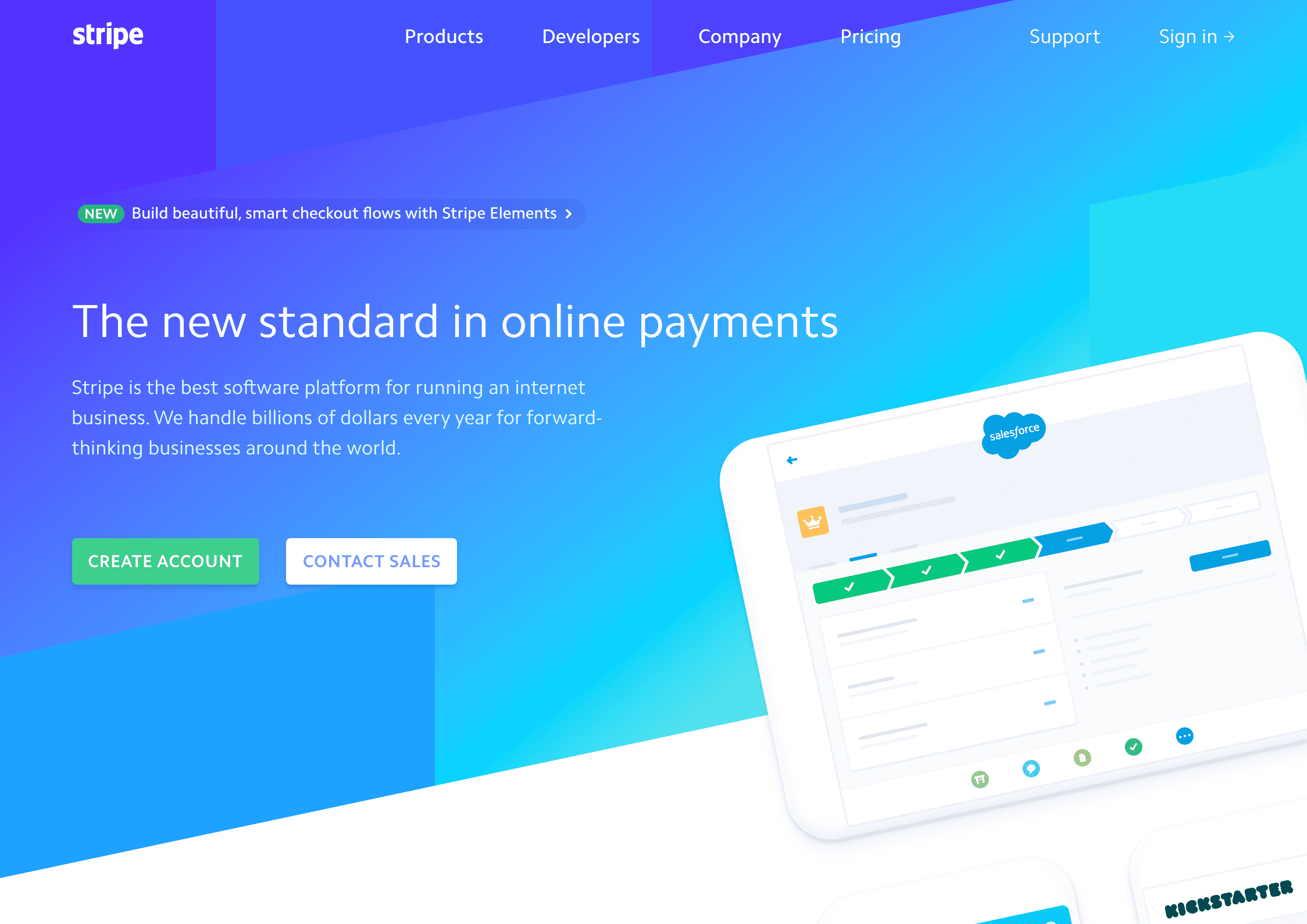
Pictured above is the design for Stripe's main landing page. At first glance, here's what really sticks out to me:
- Crisp typography
- Stunning color palette
- High-quality images
- Bold call-to-action buttons
Let's start with the first observation: the font.
Typography
Stripe uses a font called Camphor. It's a modern, uncluttered, sans serif font designed by Nick Job in 2010. It really shines here and looks great in a variety of weights.
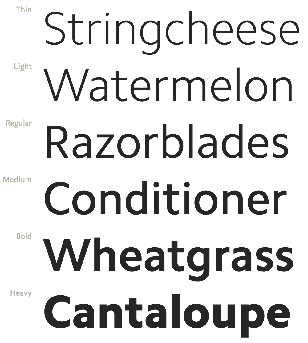
Typography is arguably the most important part of your design since it's the medium for your content. Stripe does an excellent job of using different weights and colors to provide adequate contrast. This draws your attention to the things that matter most.
Let's see how we can make our font as crisp and clear as possible. First, we'll define our font family to be Camphor along with some fallback fonts. Note: Camphor is not free and should be purchased if you're planning to use it in production. However, I did find a gist containing the font which you can mess around with.
We can utilize the text-rendering CSS property to allow us to choose quality over speed, as well as some vendor specific properties to make our font sharper. Note: These should work for Chrome, Safari, and Firefox on Mac.
body {
  font-family: Camphor, Open Sans, Segoe UI, sans-serif;
  text-rendering: optimizeLegibility;
  -webkit-font-smoothing: antialiased;
  -moz-osx-font-smoothing: grayscale;
}
Example
In this example, I apply -webkit-font-smoothing followed by text-rendering.
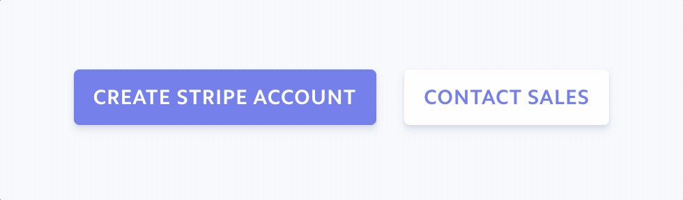
Okay, so we have a solid font. Let's use it on some buttons!
User Experience (UX)
Indicating a visual response when hovering over items like buttons and links provides a great user experience. In the example below, you'll notice the buttons shift slightly up when hovered and change colors to a lighter shade of purple. The box-shadow also becomes a bit more intense.
button:hover {
  color: #7795f8;
  transform: translateY(-1px);
  box-shadow: 0 7px 14px rgba(50, 50, 93, 0.1), 0 3px 6px rgba(0, 0, 0, 0.08);
}
This really makes it feel like the button is meant to be clicked. It's a wonderful experience. You can view code to recreate the buttons here on CodePen.
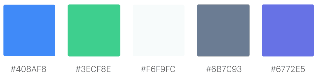
Color Palette
I personally love the color palette of Stripe's website. It's bright and grabs your attention with some nice accent colors.
Utilizing SVGs
Something else that really stuck out to me was how high quality their images looked. This is because they use SVG (Scalable Vector Graphic) images instead of normal .png or .jpg files whenever possible. This has a multitude of benefits.
- Smaller file sizes
- Allows the ability to animate the image using CSS
- Looks crisp on any size display from mobile to desktop
That tablet displayed on the home screen? Yeah, that's a .svg that's been scaled and rotated. Here's the .svg file from Stripe's website. Notice how when you zoom in the quality remains clear.

Animations
Animations are the extra polish on top of an already beautiful design. Throughout all of Stripe's pages, you'll find a variety of animations like the ones shown below. Some are more subtle than others, but each serves a purpose.

Here's another example that I really like.
If you've never worked with CSS animations, I wrote a quick article showing how to learn them by example.
For a more detailed look into creating animations, I highly recommend this blog post by Stripe's own Benjamin De Cock breaking down the front-end experience of their product Connect.
Summary
Hopefully this article gave you some insight into how Stripe designs their websites and inspired you to create something of your own! Here's three main points to leave you with.
- Typography choices are critical
- Don't underestimate the value of good UX
- Use SVG images whenever possible
Cheers! 🍻